
In this entry, I will discuss some of the colours and choices made when painting up my Black Wolf Mercenaries, how to avoid a "cartoonish" colour scheme and how painting black doesn't have to be boring.
 |
| Hunting Season! |
The studio scheme for the Black Wolf Mercenaries continues the theme of the original Black Wolf submarine, with a striking black and red colour scheme that gives a strong sense of stereotypical Soviet-era military - it has always reminded me of the Soviets and Brotherhood of Nod from the Command & Conquer/Red Alert series of computer games.
 |
| Kane Lives! |
 |
| It's cool, but it's not Victorian Steampunk |
The black would remain - given the tactics of the Black Wolf Mercenaries and their tendency towards stealth attack, I was put in mind of the Stealth Boat from the James Bond movie Tomorrow Never Dies.
Black was also a colour I had not used for a Dystopian Wars fleet yet, so I thought I would give it a go.
 |
| Fury-class Corvettes |
The Fury-class Corvettes were painted without any red accents, making them look a tad monochrome but also smart and functional - aggressive hunting ships with no frills or distractions from their objective. The spot colours here are the brown of the decking and the silver of the Fore Guns - there is a lot of silver as these ships are built around their gun!
The hull was highlighted up from a basecoat of German Grey by using increasing amounts of Vallejo Grey Green, a great colour I wish I had discovered years ago, with Medium Sea Grey as the extreme highlight. These highlights were intended to be extreme, only on the raised areas and edges. The models are, overall a very dark grey rather than black itself, as I feel just black was a bit too much for Dystopian Wars.
The initial stages for the other details started with blocking in colour, base coating the brown areas, the silver and the brass for the smoke stacks, and then washing the area with a black wash. Highlights were built up over the top, and then the weathering was added around the command section and in the lines between the hull sheets. The muzzles of the Fore Guns were highlighted further up to white - this decision was to bring out the guns even more as a blackened muzzle would disappear into the hull. It could also represent their Sturginium Rounds if one was narratively minded - for my fleets Sturginium (wherever it may appear) is painted turquoise and highlighted up to white.
 |
| Nemesis-class Battle Cruisers |
The Nemesis were the first ships painted for the fleet and came to define the different techniques used across the fleet for guns, hulls and details. I avoided the large amount of red used by the Spartan team and concentrated on making the black hull look as detailed as it could - highlighting on all the rivets and seams, weathering across every section and dripping down from anchor points, etc.
The long metal walkway is a defining feature of the Nemesis and this area got special attention when painting and weathering. The central drop on point is the focus of the model, bringing colour through either the red of the rocket battery or the gold of the Camouflage Generator.
Overall the ships could be considered somewhat dull, but I wanted them to have the look of a ship built for stealth. Like the Furys, they may not draw the eye like the submarines or the skimmers, but that's okay with me as they do not need to be the focus of the fleet.
 |
| Manticore-class Support Skimmers and their Reaper Attack Submarine complements |
The Manticore Support Skimmers were the first test of using a large amount of red on a Black Company model. To make the red appear as an extra rather than an actual part of the colour scheme (which, defined by the Fury and Nemesis squadrons, did not have any red per se), I decided to paint the Reapers red, a decision I would expand to all of the submarines in the fleet.
The red begins as the base of Citadel Mephiston Red mixed with Rhinox Hide, then layered up to pure Mephiston, then Blood Red and Blood Red with Tausept Ochre. Some of these are old paints so I am not sure what the modern equivalent would me. The red is then washed down with a light black wash to bring the layers together.
The Support Skimmers also have the most amount of wooden decking for a Black Wolf ship, which combined with the red makes them the most colourful and striking elements of the fleet (aside from the Death Bringers). The Gravity Nullification Engines also add a gold colour, though it is not especially visible. I am very happy with how these models turned out.
 |
| Black Company TFTs |
 |
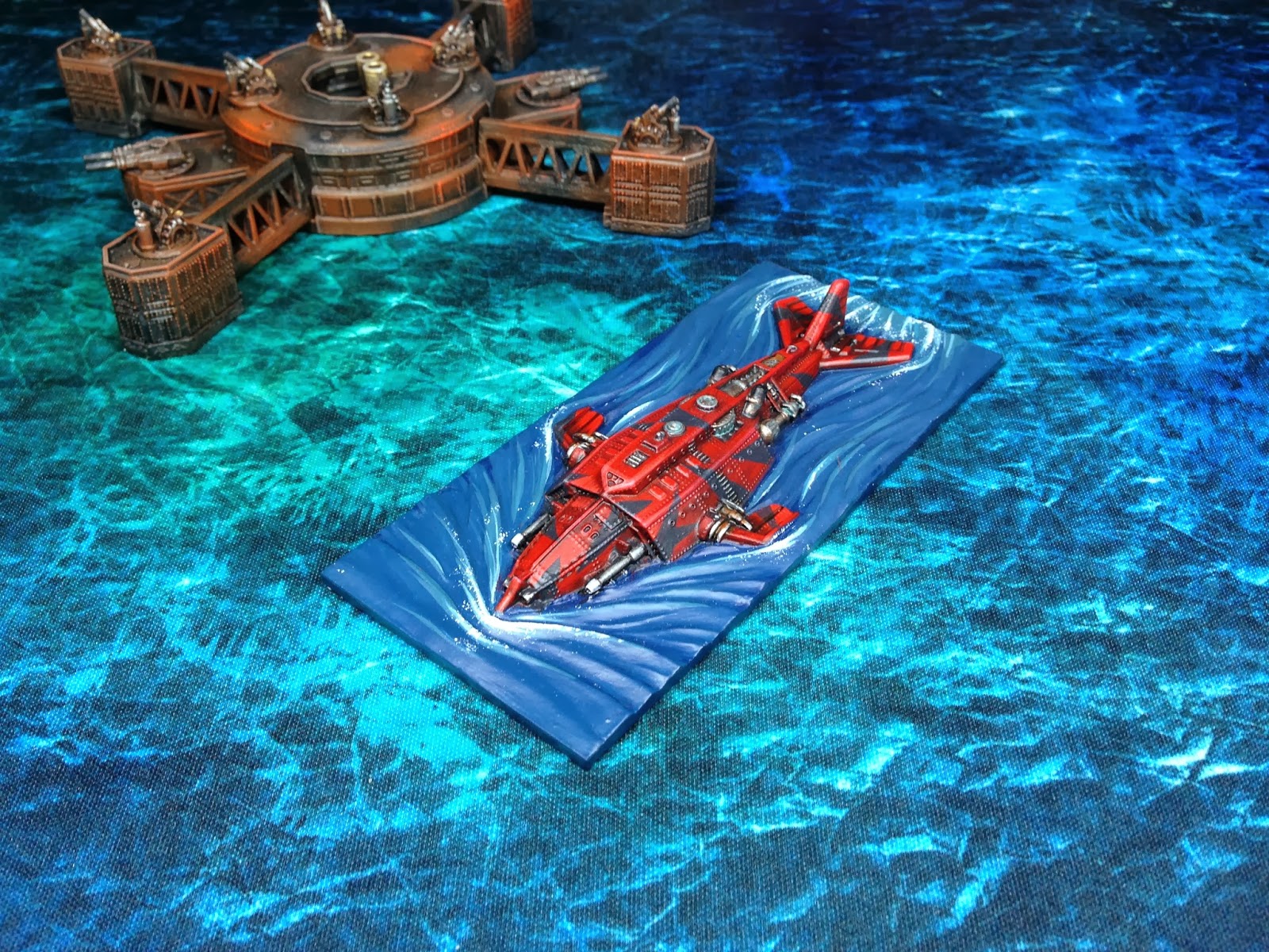
| Death Bringer-class Submarines |
 |
Following the success of the Reaper Attack Submarines, I decided that the Death Bringers would be red. After some consideration though, I realised solid red would be a bit much and thought about adding in some camouflage to break up the scheme and make it look more visually appealing. After the success of the first one, which I dubbed the Red Viper (spot the reference for a prize), I decided that reversing the scheme for the second Death Bringer would be visually appealing.
It was only some weeks later that I realised and remembered my inspiration - a Black Wolf painted some months (years?) before by Spartan forums contributor You Look Like A Nail (great username, by the way). This submarine is here, and clearly looks almost exactly the same as mine! It is funny how you can forget the source of ideas and accidentally end up stealing something years later. Nice work YLLAN - it's a fantastic scheme and all credit to you for it.
 |
| The Red Viper |
On both vessels, the red was painted first and the black neatened up around it and over it afterwards. To make the models look more natural, an incredibly light and very, very dry drybrush of Vallejo Sky Grey was "dusted" over the top, a form of weathering that blends the highlights and the different colours together. The metallics were done after this.
 |
| The assembled fleet |
- Don't Leave Big Colours Alone - in isolation, painting half a ship red (or something like that) will look crap. Make the bold colour look like part of the ship with unified highlights and weathering. This is the same advice I would give to models with slide transfers - make it look like it belongs there.
- Be Bold - though I have spent most of the article talking about how I wanted to avoid an "unrealistic" scheme, some fleets look fantastic with big, brash colours - the Chinese and Ottomans especially. A well executed colour scheme can look great regardless of the colours used.
- Weathering - though it needs to be subtle on models this small, weathering makes all the difference and makes a ship look used and realistic rather than a toy.
- Natural Colours - offset strong main colours (in this case, red and black) with natural metals, browns for decking and greys. If the entire model is painted with extreme colours it can look silly rather than impressive.
- Strong Highlights - I will mention this in any painting article I do, but extreme highlights (up to white, in some cases) really are important at this tiny scale. Don't let details disappear, make them visible!
- Washes and Drybrushing - when particularly strong, contrasting colours are used (like red and black), a light drybrush over the top with a grey or brown can bring everything together and ease transitions. This is also true of washes/glazes.
The Black Wolf Mercenaries are a compact fleet, with only six different ship/token designs to worry about. This made painting them very quick, and the whole fleet only took three or four sessions, ready for their first AAR. The models are great, detailed but not cluttered, and even though the scheme was quick and simple, it was a real joy to paint, the Death Bringers especially!
I hope this article has been somewhat informative. Good luck to anyone out there trying to balance the realisric/fantasy aspects of Dystopian Wars in their painting, I hope some of the things discussed here have struck a cord or inspired you!
Thanks for reading,
George
Many thanks for the tips given here. Very informative, and very inspirational!
ReplyDelete