
 |
After painting Thrasymedes and the Thorakitai my appetite for my ALEPH had been whetted. I started doing a bit more research into painting and in particular colour theory - heavy stuff!
One aspect of painting I struggle with is placing shadows and highlights. A technique I read up suggested using an airbrush simply to show the shadows and lights, using zenithal highlighting. Then you start overpainting (with a brush) the shadows, then highlight and finally bring it all together with the midtone. Which is how I painted this guy...


Problem is, it took so long that towards the end I got bored and haven't really done a great job of finishing him off. He's already on my strip and redo list. Still, I learned a thing or two about really thinking about shadow and light placement.
On to Myrmidons #2 & #3
These fellas are the same model, so I painted them at the same time.
I've seen a lot of websites talk about colour theory and start banging on about colour wheels... these are warm colours, these are cool colours, these colours complement each other etc. etc. etc. Completely useless to someone like me, as I'd always be left thinking yeah so what?

I accidentally discovered a post on a blog that really explained how to use a colour wheel practically; for me it was perfect.

As a result, I mixed in red to make a shadow colour with the turquoise, and sunny skin tone (great colour) to make a highlight colour. Absolutely brilliant, I love the tones I've got going on now.
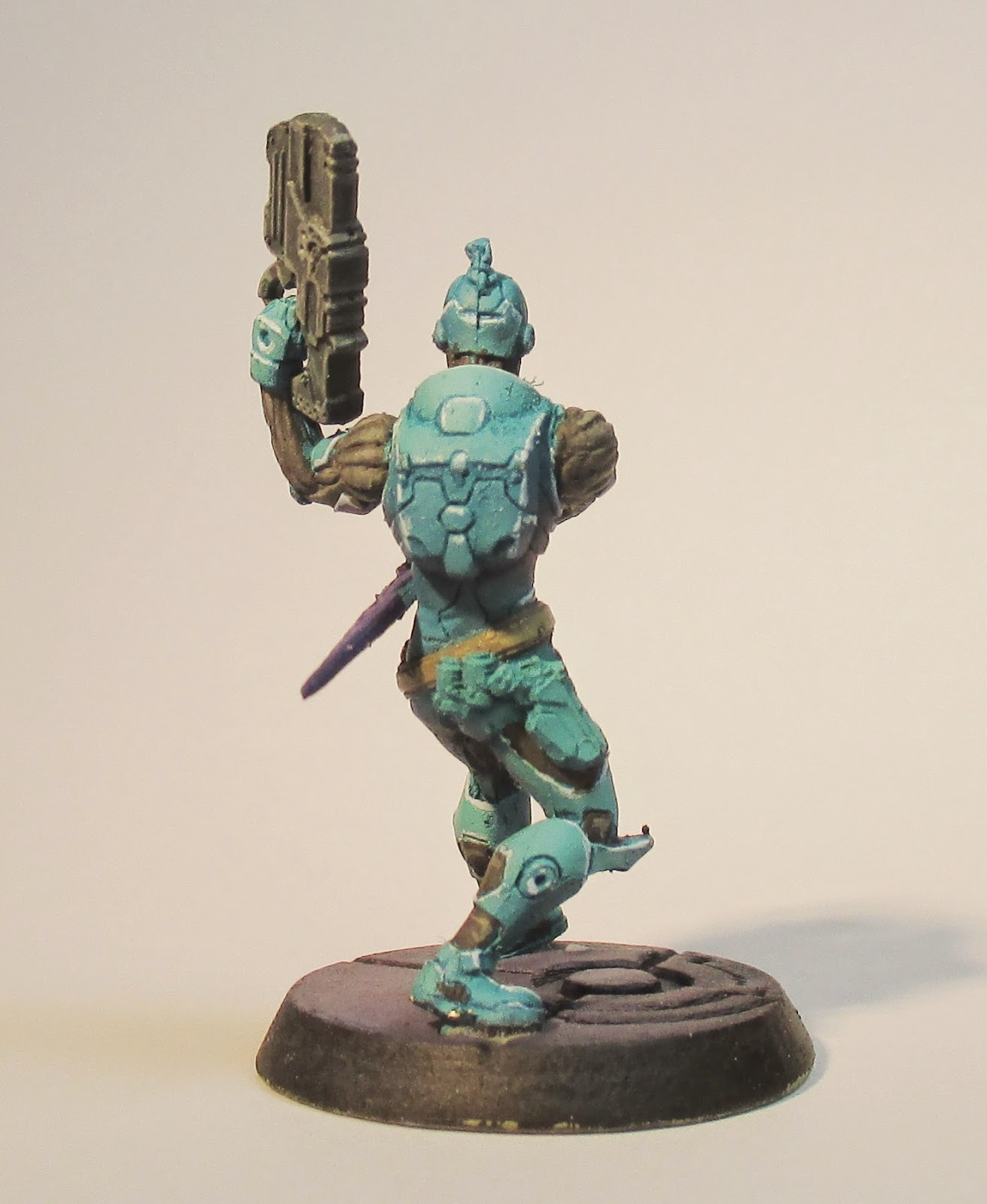
I simply used an airbrush to apply the turquoise colours, then inked in the recesses and edge highlighted, before moving onto the cloth and metallic areas.
Okay, so I'd made a bit of head way, but I'm far from satisfied with the final look. Progress is still progress.
At this stage I decided to up the ante. Problem is, I keep thinking to myself, "well I can always strip them or replace them," which means I kinda do half a job.
Well no more, I decided to paint Ajax. He's too expensive a model to simply replace because of a bad paint job. I also decided I'd get so far with him, then seek out some feedback.
First stab, I was a lot heavier applying the shade tones, something which got lost in the above Myrmidons and went a lot lighter in the light tones. I used several colours for the edge highlights instead of a ubiquitous same colour.

I pushed the boat out massively by attempting NMM gold, skin tones and eyes...


For a first stab Ajax wasn't looking too bad, but not brilliant. He definitely has an unfinished feel to him. So, I signed up to a forum frequented by some amazing painters - Platoon Britannica and took the plunge by introducing myself and throwing Ajax up for some criticism.
Fortunately the guy who wrote the practical advice on colour theory was kind enough to give me some help... so with that advice I improved him...

Reduced some of the blue armour.

Funky green glow on the forearms and metallic sheen on the hammer.

Deeper recesses on the bag.
I've still got plenty of improvements I can make to my painting, but in four models I've also refined my process a great deal. Getting good feedback is invaluable, sometimes what's obvious to one person is lost on another.
Thanks for reading, if you have any thoughts or feedback then please do leave a comment.
Winner Dave
P.S. The bases are crap and need to be torn off and redone.
No comments:
Post a Comment